Regular 1:1 meetings are the foundation of healthy communication between employees and the company. However, simply conducting them is not enough. To timely identify burnout, understand the workload on managers, and track the most popular team requests, you need quality analytics.
That's why HURMA provides a detailed "1:1 Meetings" report. It allows HR professionals and managers to:
Assess the overall team mood thanks to automatic calculation of the average risk level;
Analyze the topics of requests to understand what concerns people most (for example, salary review, career growth, or general well-being);
Control the consistency of processes by tracking the number of scheduled, completed, and canceled meetings;
Visually assess the communication history with each employee using an interactive heat map.
The report is available in the "Statistics" section ("HR" tab) for users with the HRM plan and appropriate access rights.
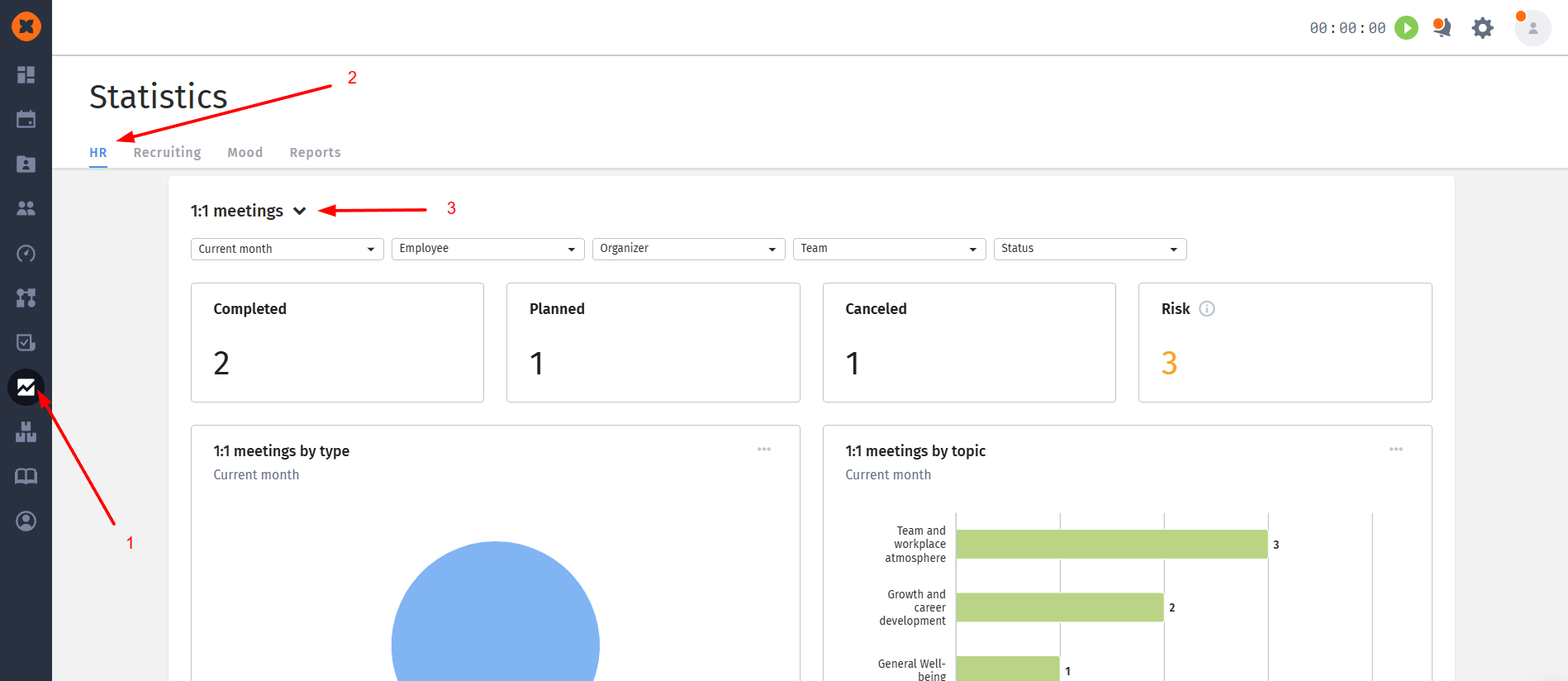
Let's look in more detail at what blocks this page consists of and how to work with it.
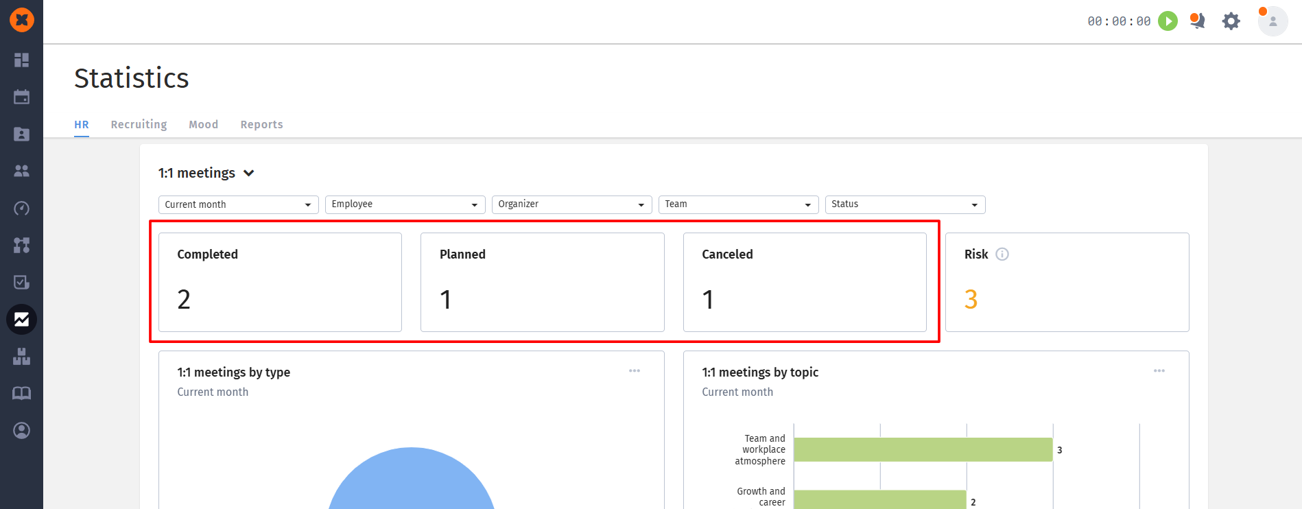
At the top of the page there are four widgets that provide an instant snapshot of the company:
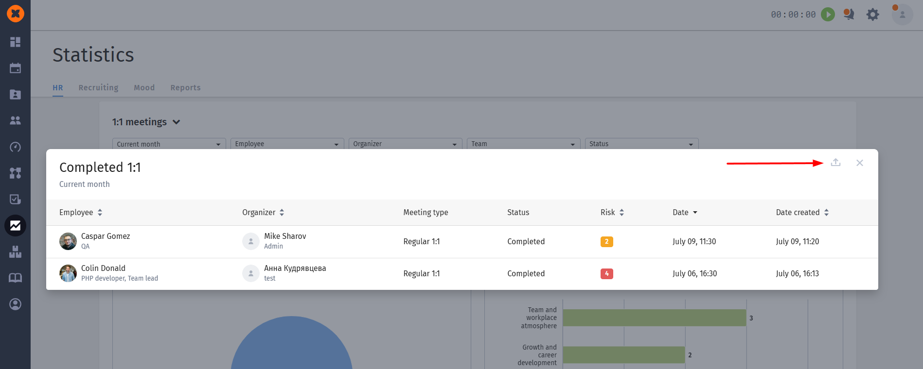
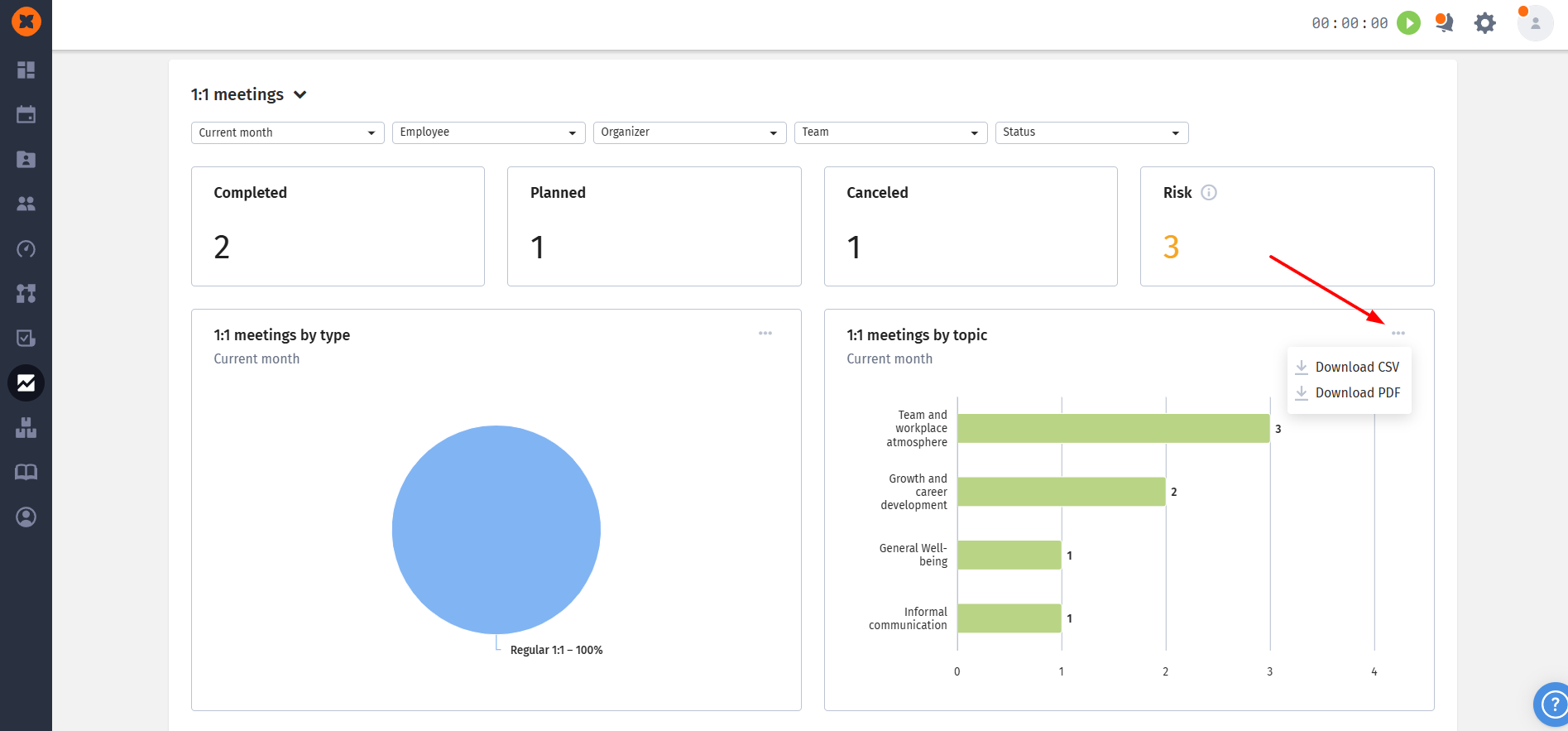
Completed, Planned, Cancelled: display the total number of meetings in the corresponding status. These widgets are clickable - when clicked, a modal window opens with a detailed list of meetings (which employee, who is the organizer, what type, status, date). This list can be instantly exported to XLSX format;
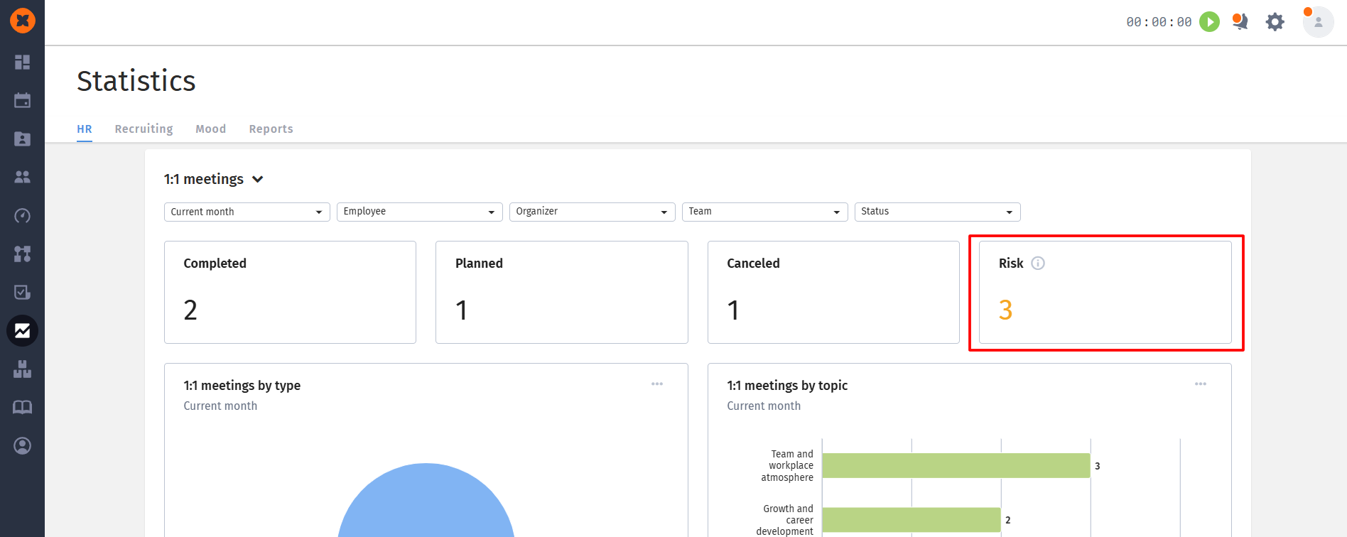
Risk: the widget shows the average risk level across completed meetings (sum of all ratings divided by the number of meetings with a rating). For convenience, the widget has color indication: green (rating from 1 to 1.99), orange (from 2 to 3.99) and red (from 4 to 5).
For deeper analysis, three interactive diagrams are provided:
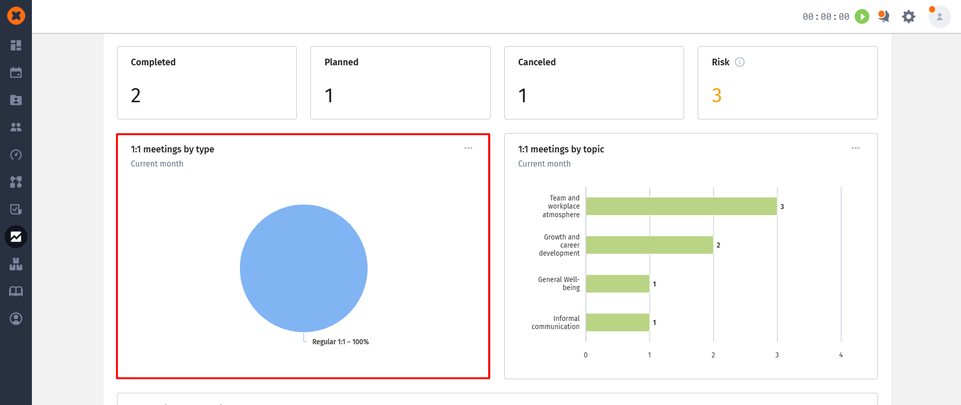
1:1 meetings by type (Pie chart): shows the percentage distribution of meetings (for example, Onboarding, Performance review, etc.);
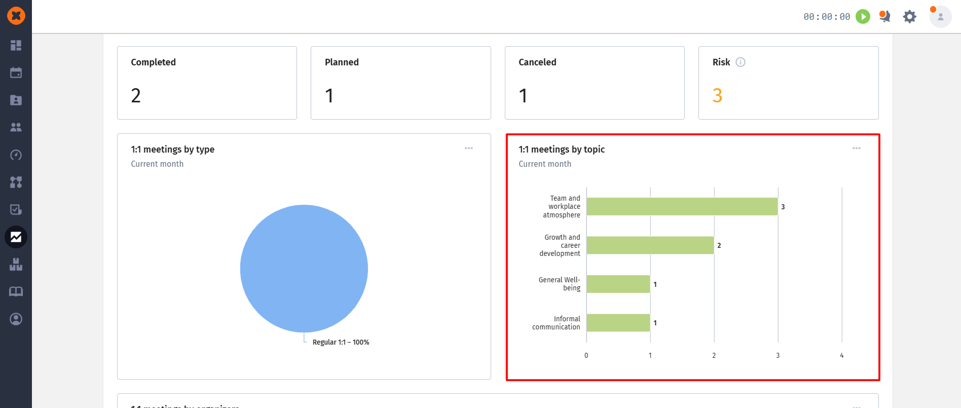
1:1 meetings by topic (Bar chart): shows the most popular discussion topics. If multiple topics were discussed during one meeting (for example, "informal communication" and "well-being"), the system will count this meeting in the statistics for each of them. Topics are sorted from most to least popular;
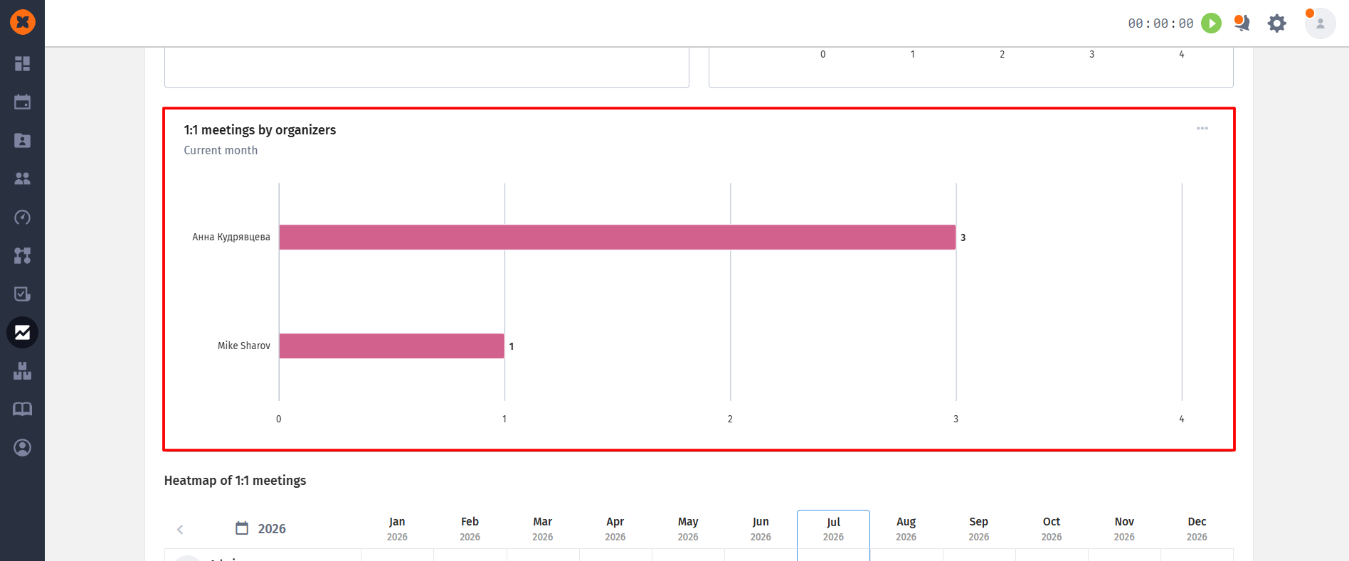
1:1 meetings by organizer (Bar chart): displays the number of meetings conducted by each manager or HR manager, which helps assess their workload.
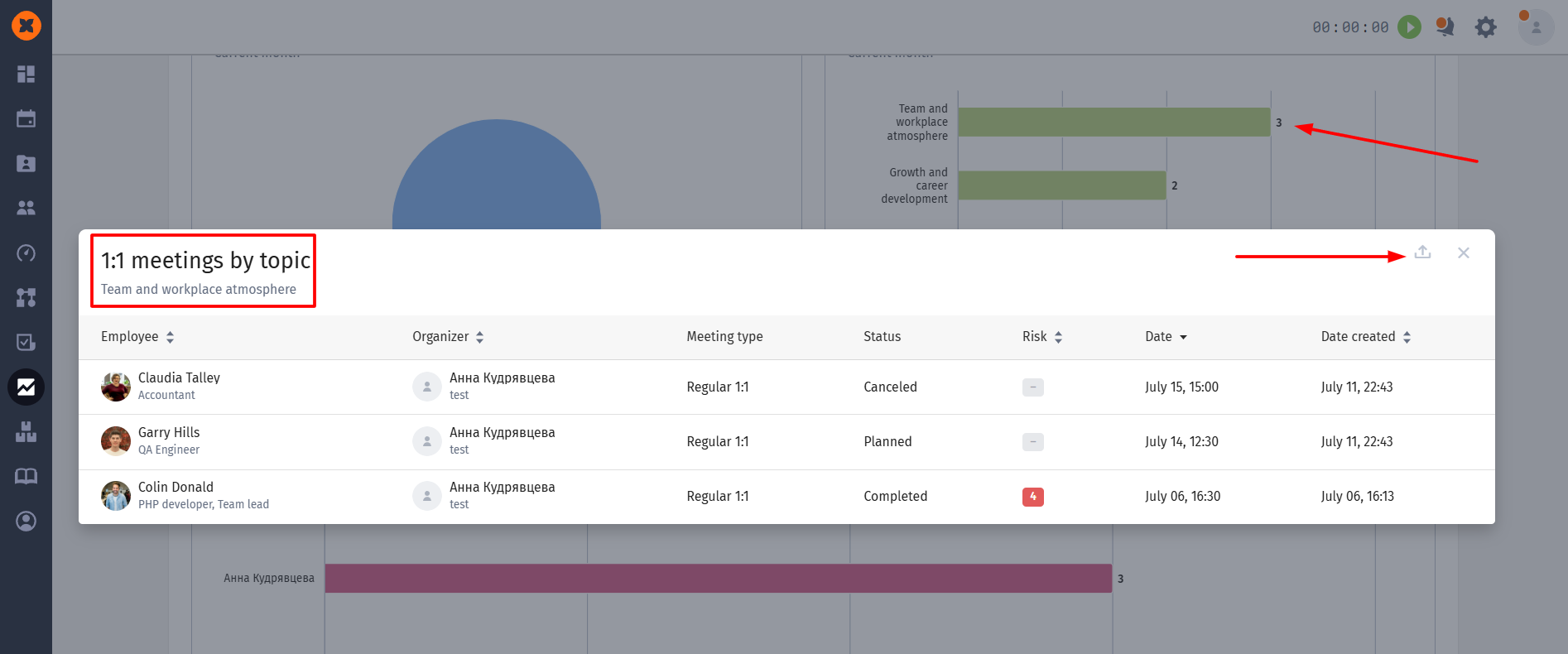
By clicking on any sector or column in the charts, you will open a detailed list of corresponding meetings with the ability to download it in Excel (XLSX). The diagrams themselves can be downloaded as an image (PDF) or as a table with data (CSV).
A heat map is the most visual tool of the report, showing the dynamics of meetings for the current or past year.
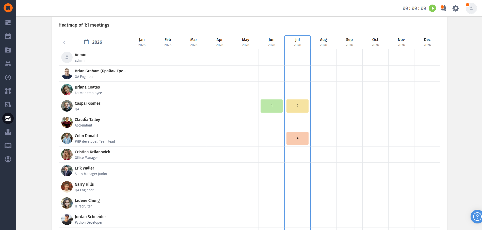
Structure: all employees are arranged vertically (according to your global visibility), and 12 months are arranged horizontally;
Indication: meeting icons are located in the cells. They are colored according to the risk score assigned. By clicking on the icon, you will immediately go to the profile of this meeting in a new tab;
Important display conditions: only meetings with the status "Completed" and for which a risk score has been assigned appear in the heat map. If at least one condition is not met (for example, a meeting was held but without a score), it will not be displayed here. If more than 9 meetings occurred in one month, only the last 9 will be shown on the map.
You can customize the data on the page using a set of filters:
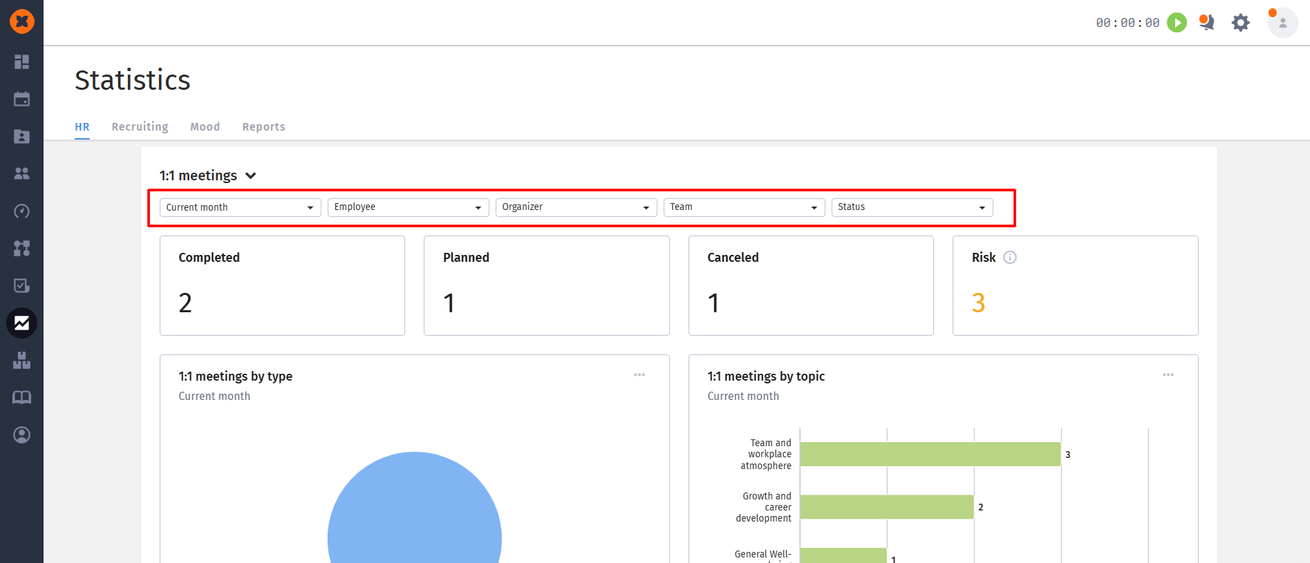
Period: choice by month, quarter or year (current or previous);
Employee and Organizer: search and filter by specific people;
Team and Status: breakdown by departments or by specific meeting status.

