Usually, the task of finding information involves reviewing dozens of sources, reaching out to recruiters and HR professionals you know, searching chats, and manually compiling spreadsheets. Sometimes, it is possible to use reports from consulting companies with salary analytics, but not everyone can afford them, and they are quite expensive. In addition, the information in these reports quickly becomes outdated, especially in such a dynamic industry as IT.
Recognizing this time consuming problem, the HURMA team developed a salary analytics and statistics feature. From now on, you can view salary statistics for IT positions directly in the system.
The new functionality allows you to:
prepare a salary offer for a vacancy;
compare a candidate’s expectations with market figures for a similar position;
prepare a recruitment budget for a position that has not previously existed at the company;
get reliable salary market data for IT positions to prepare Job Offers for candidates;
prepare a salary offer for an employee after a Performance review.
The chart showing salary distribution by position is generated based on aggregated data, that is, collected through:
surveys of candidates and recruiters;
screening information from public sources with salary analytics;
labor market analysis using AI (artificial intelligence), which processes and classifies large amounts of data. The algorithm automatically identifies the position, skills, core tech stack, and market demand and supply for the position.
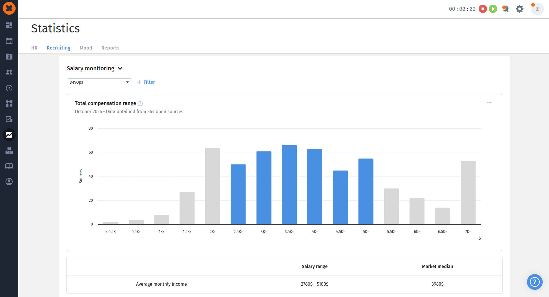
Salary statistics are available for the month and year specified in the chart title.
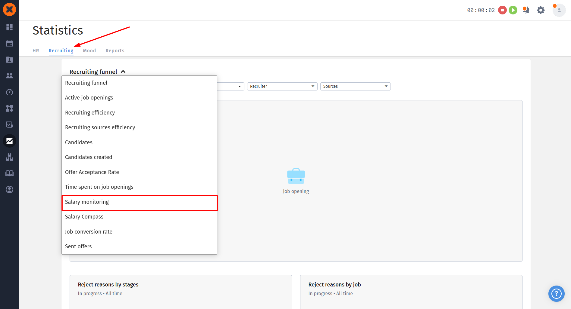
Salary statistics are in the “Statistics” section - the “Recruiting” tab.
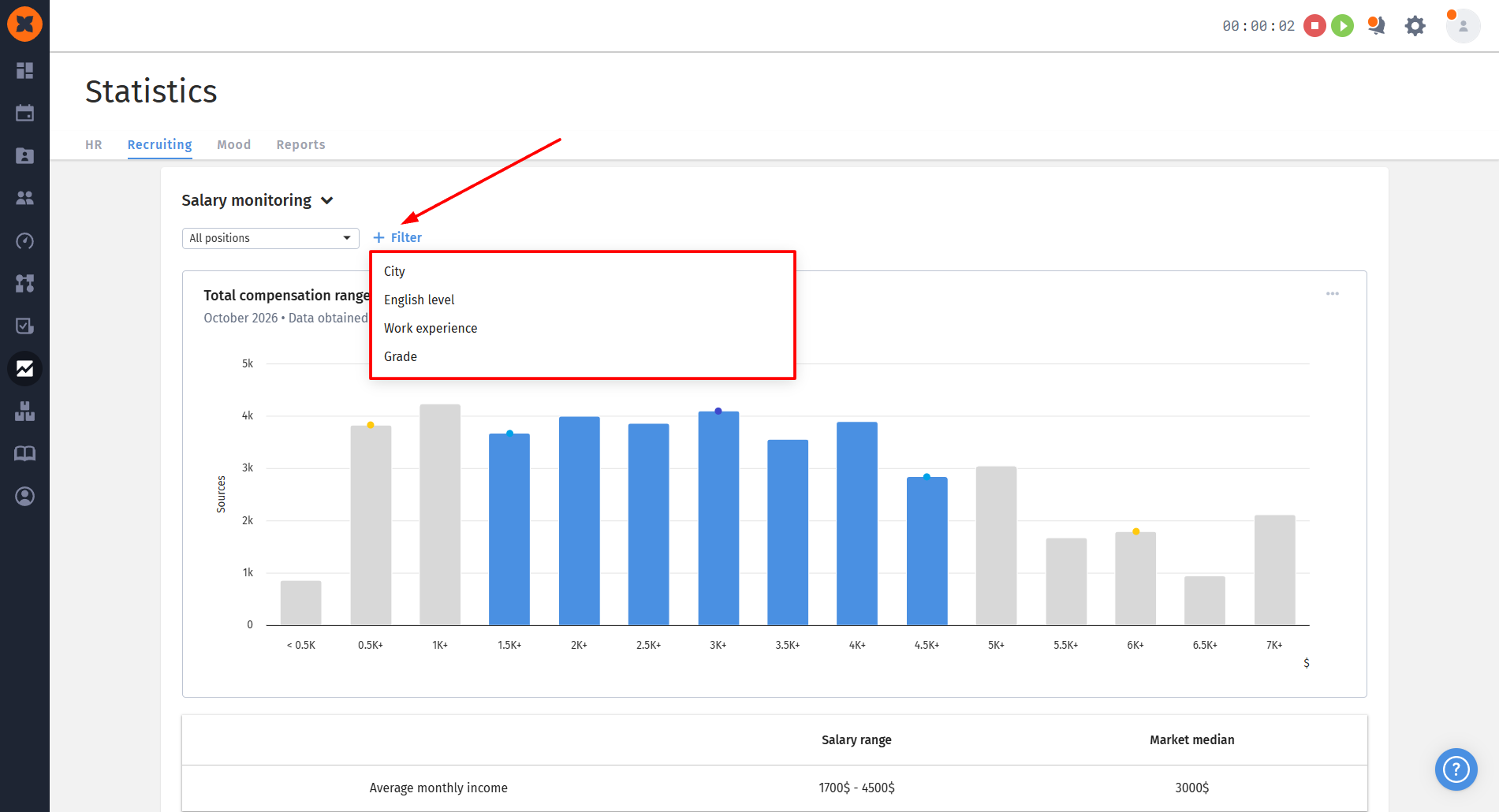
On the page, you can select the position for which you need to determine the salary range, as well as specify other search parameters:
city;
english level;
work experience;
grade.
The chart shows the distribution of salary values across the following ranges:
lower decile: only 10% of the data is below this mark;
1st quartile: 25% of the data values are below this mark, and 75% are above;
median: 50% of the data values are below this mark, and 50% are above;
3rd quartile: 75% of the data values are below this mark, and 25% are above;
upper decile: only 10% of the data is above this mark.
Using these charts makes it possible to develop an effective recruitment strategy. Every company has its own approach: some focus on the 1st quartile to keep budgets under control; others, on the contrary, recruit the best candidates by offering more attractive salaries, focusing on the 3rd quartile and upper decile.
Knowing the salary distribution ranges for a specific position helps determine whether employees’ current salaries meet market requirements and revise them in a timely manner to motivate and retain specialists.
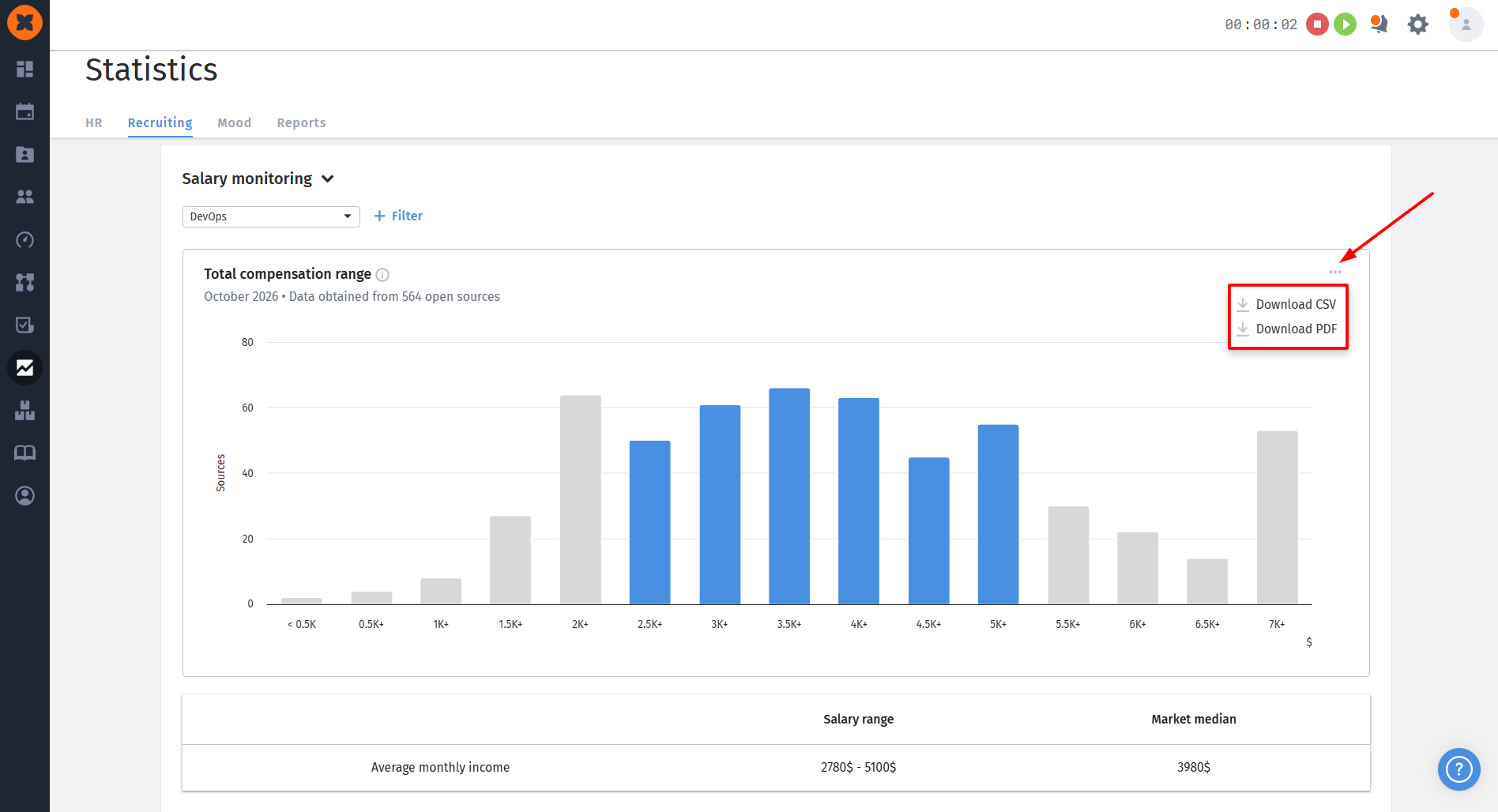
After generating a chart for a position, you can download it as a .pdf file to, for example, include the data in an email to someone, or save it as a .csv file for further processing, for example, in Excel.