HURMA allows you to easily customize the design of your career site to match your corporate branding.
The new career site builder makes it easy to create a modern and attractive company page for candidates without involving developers or designers.
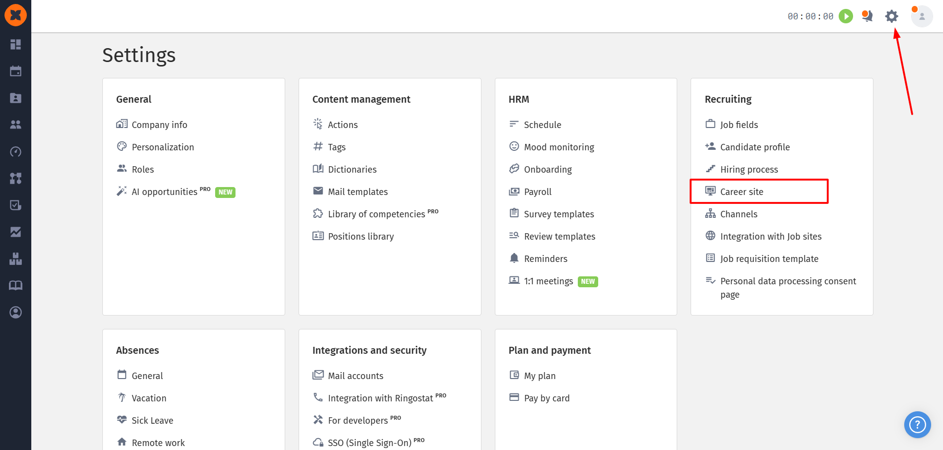
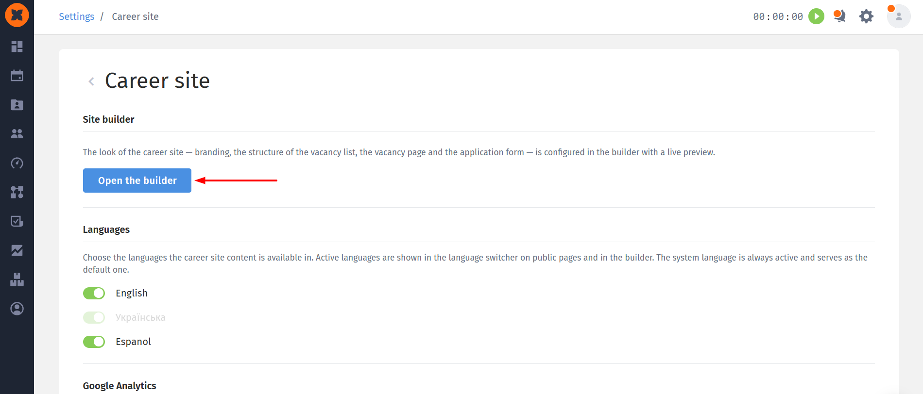
To access the settings, go to “Settings” - “Career site.”
After opening the section, the main control panel for your company’s career site is displayed.
This page contains three main settings blocks:
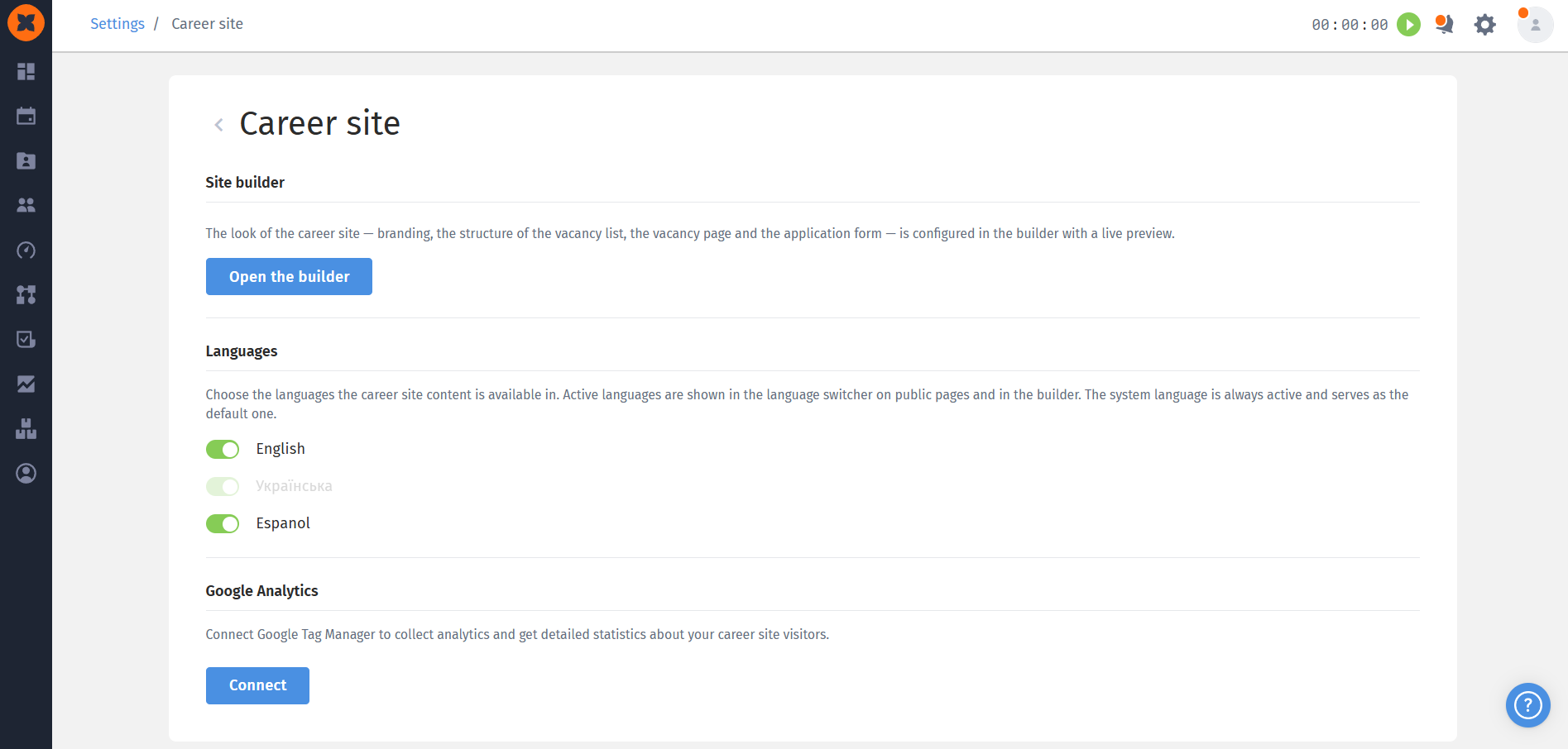
“Site Builder” block: this is the entry point to the visual editor. Clicking “Open the builder” opens the builder, where you can configure branding, the structure of the vacancy list, individual vacancy pages, and the application form, with a live preview;
“Languages” block: allows you to specify which languages will be available for your site content. Enabled languages will be displayed in the language switcher on the career site for candidates and in the builder itself;

“Google Analytics” block: allows you to connect analytics tools to collect statistics, track career site traffic, and obtain relevant data.
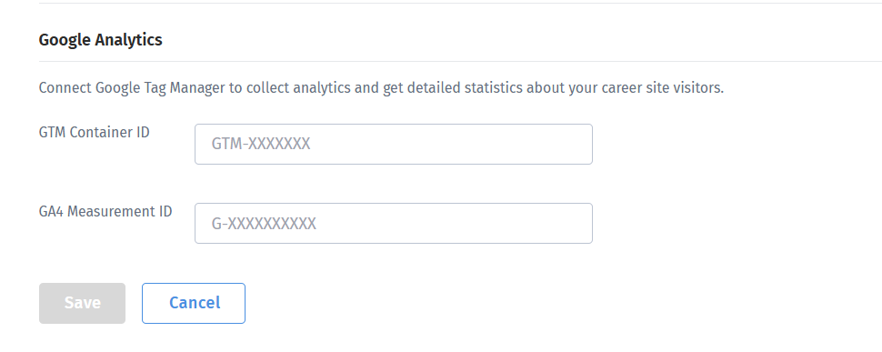
To connect Google Analytics, click “Connect,” enter valid details, and save the settings.
To start visual editing, click “Open the builder.” A full-featured editor will open, allowing you to flexibly customize the appearance and structure of your career site.
The top section of the builder contains tools for controlling the result in real time:
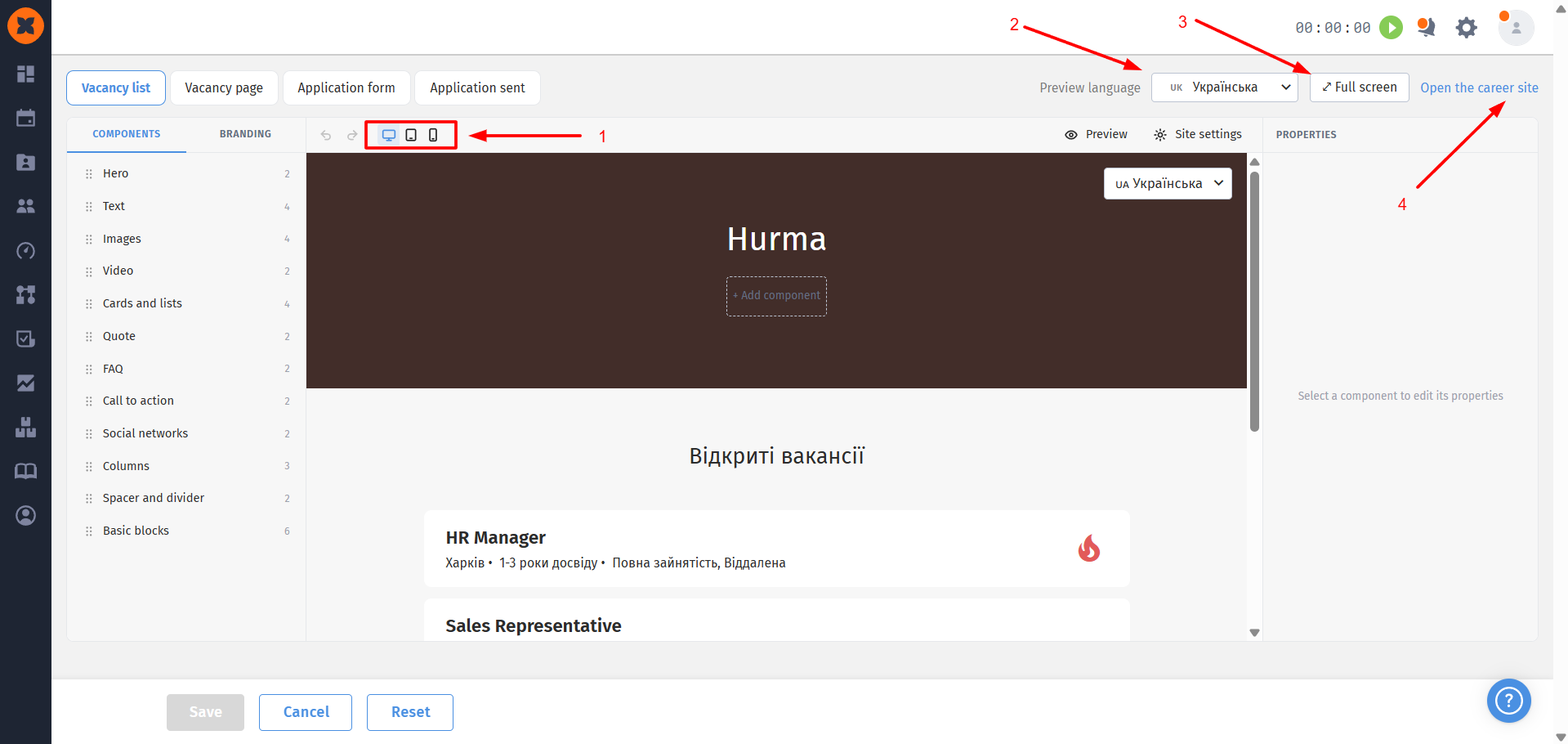
Live-preview: switch between “Desktop,” “Tablet,” and “Mobile” display modes to check how the pages look on different devices;
Preview language switcher: if two or more languages are enabled in the settings, a language selector appears in the top panel, allowing you to check how the content looks in each language;
Full-screen mode: expand the builder to full screen for more convenient editing;
Direct link: quickly open the public career site in a new browser tab.
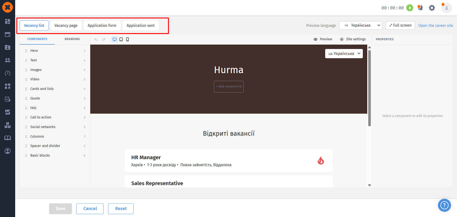
The builder allows you to edit each of the four site pages separately:
Vacancy list;
Vacancy page;
Application form;
Application sent.
In addition to page-specific settings, the “Site settings” button provides global parameters that are applied across the entire site:
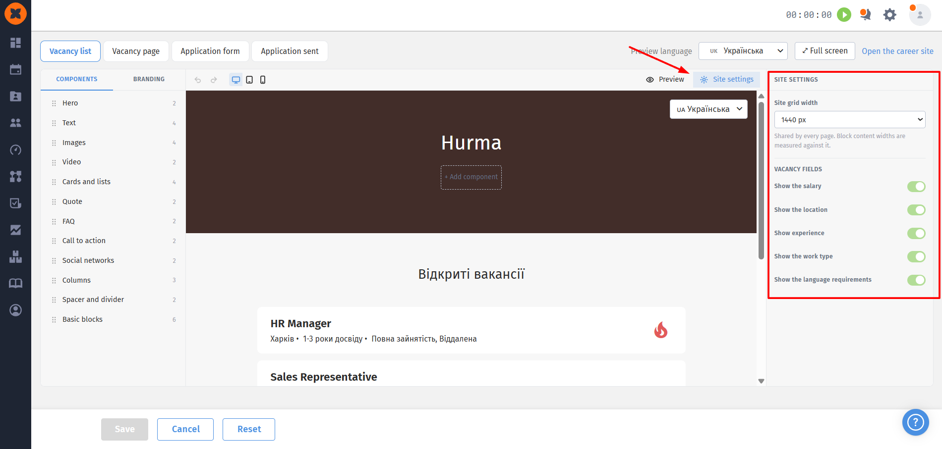
Site grid width: defines the overall page layout;
Vacancy fields: allows you to centrally manage which vacancy details are displayed. For example, you can hide the salary with a single toggle, after which it will no longer be displayed either in the vacancy list or on individual vacancy pages.
Pages are built using a cascading block-based approach:
Block library (Left panel): all blocks are grouped into categories, with the number of available variations displayed for each category. Hover over a block to see its preview;
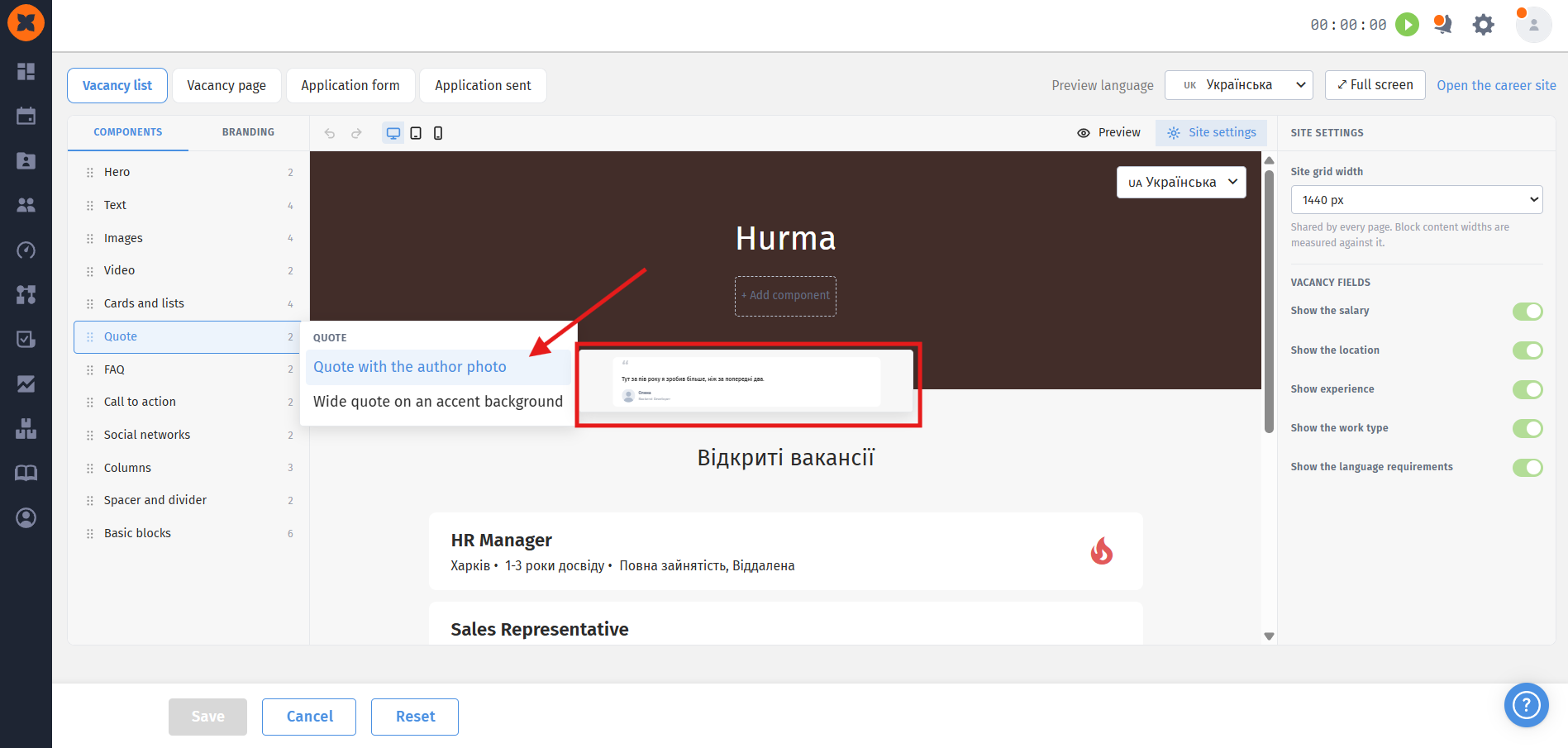
Adding and rearranging blocks: a block is added to the workspace between the Header and Footer. All added blocks can be freely dragged up or down with the mouse to change their order;
Special and one-time blocks:
the Hero block (“Join our team”) is a themed block available for addition only on the Vacancy List page;
the “Vacancy list” block has several display variations and can only be added to the Vacancy List page;
the Header, Footer, and Application form can only be added to a page once. After being added, they are automatically removed from the list of available blocks in the left menu;
Elements inside blocks (the “+” icon): additional elements can be inserted inside an already added block. For example, you can add text fields, buttons, or videos. For videos, a URL must be provided —=- the field cannot be left empty;
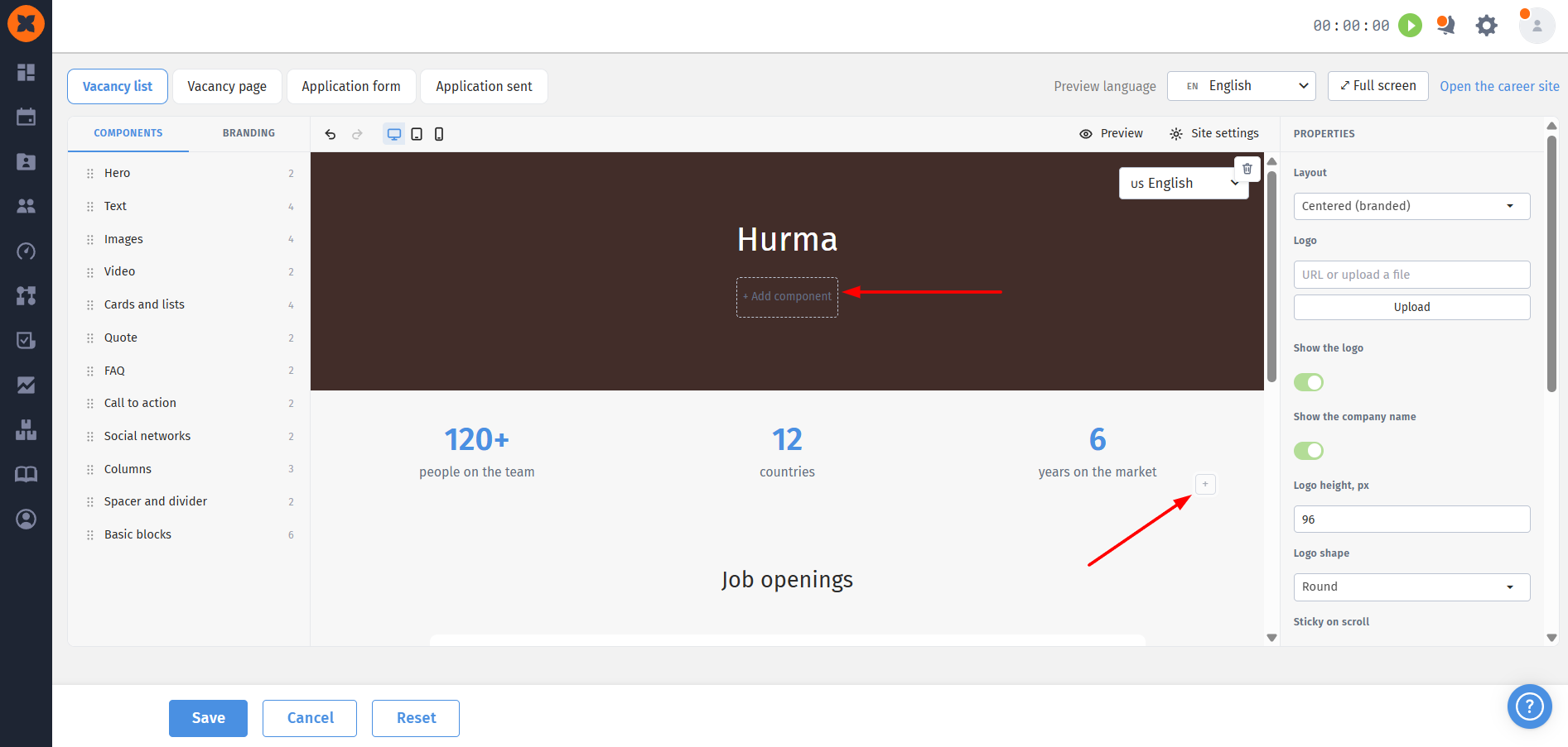
Navigation menu (Header): menu items can be configured either to navigate to an external URL or to use anchor scrolling to a specific block on the page.
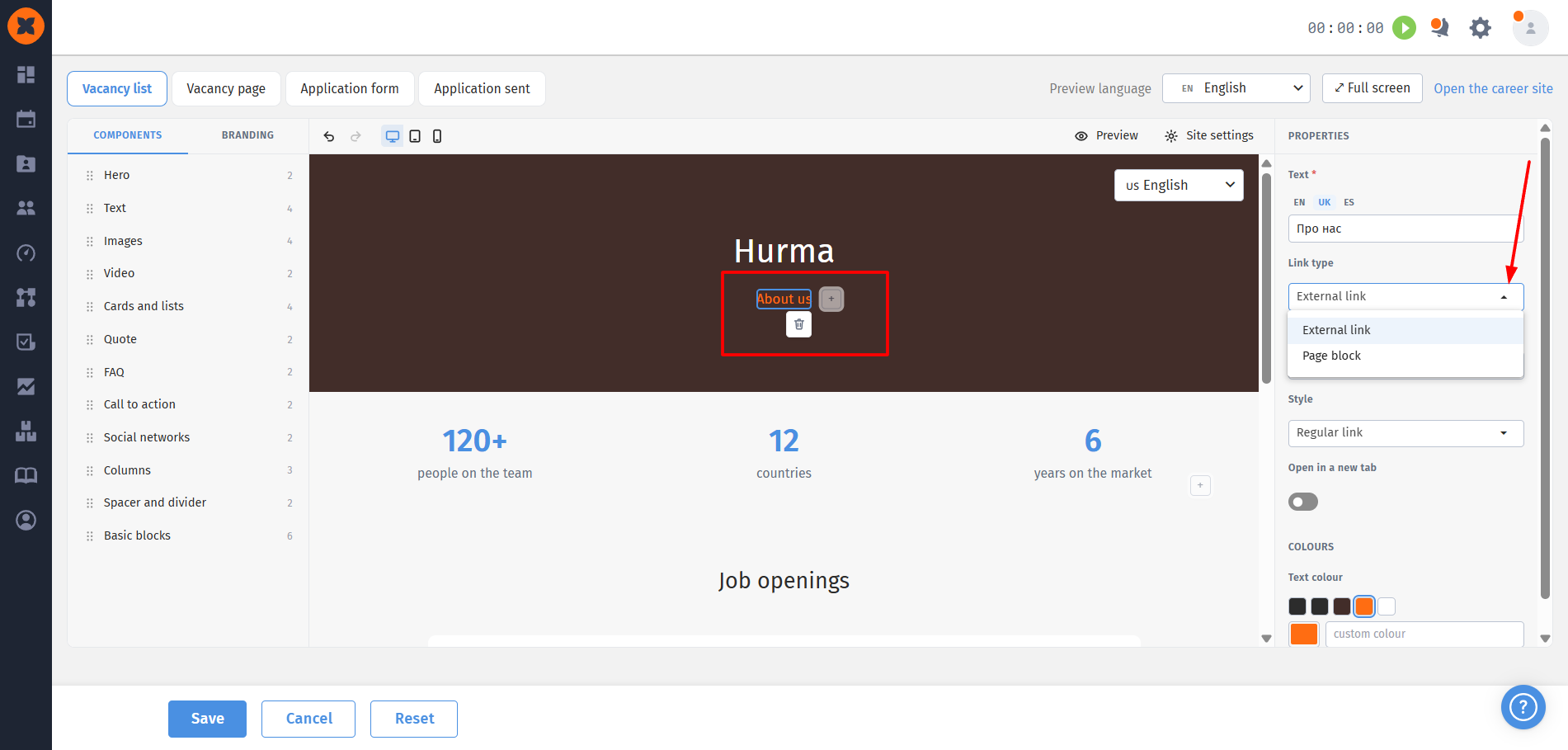
Clicking any block opens its properties panel:
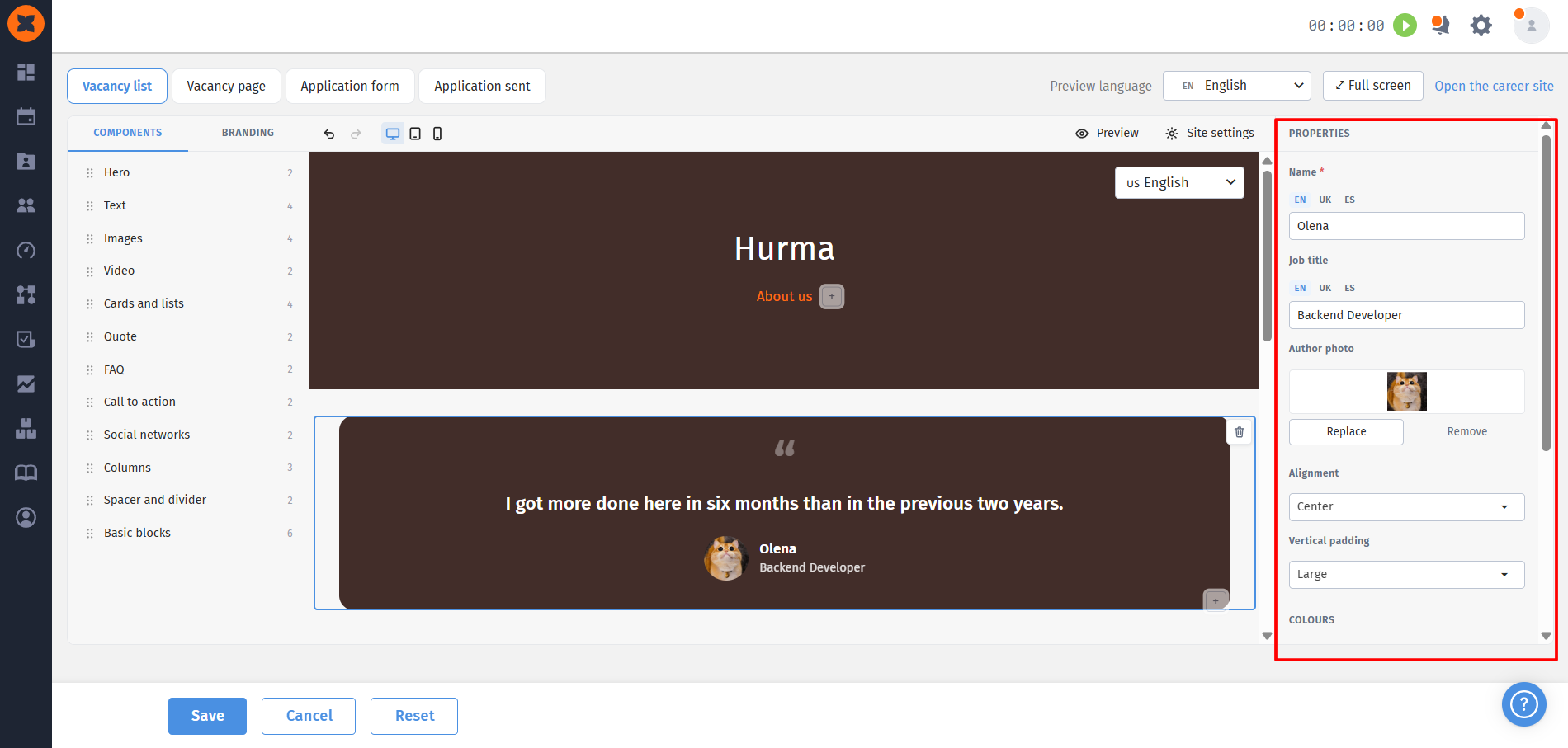
Visual styling: configure text alignment, dimensions, spacing, heading colors, labels, and card background using a color picker or by entering a HEX code;
Text editor: the built-in editor allows you to format text using the required styles;
Image replacement: default/template images in blocks must be replaced with your own company images. If you try to save the template images, the system will display a reminder.
Required fields: when adding new blocks, the system automatically creates default template text for additional languages. If you change the original content, switch to the required language using the builder's language selector and edit the translation;
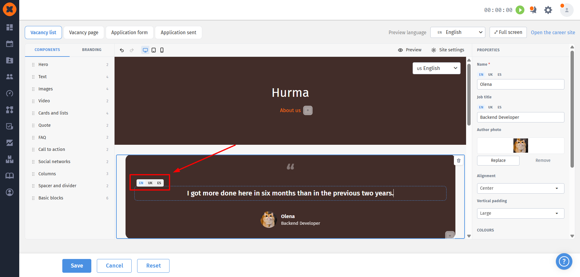
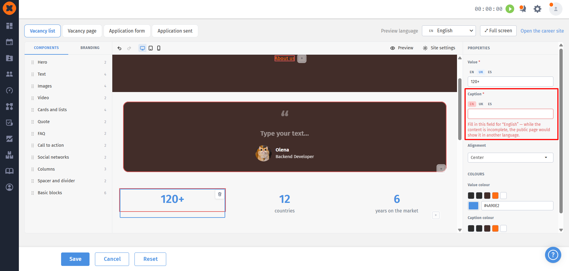
Protection against empty fields: if you change the text in one language (for example, Ukrainian) but leave the field empty for an additional language (for example, English), the system will display an error and will not allow you to save the changes.
All global styles applied across all site pages are configured in the “Branding” block:
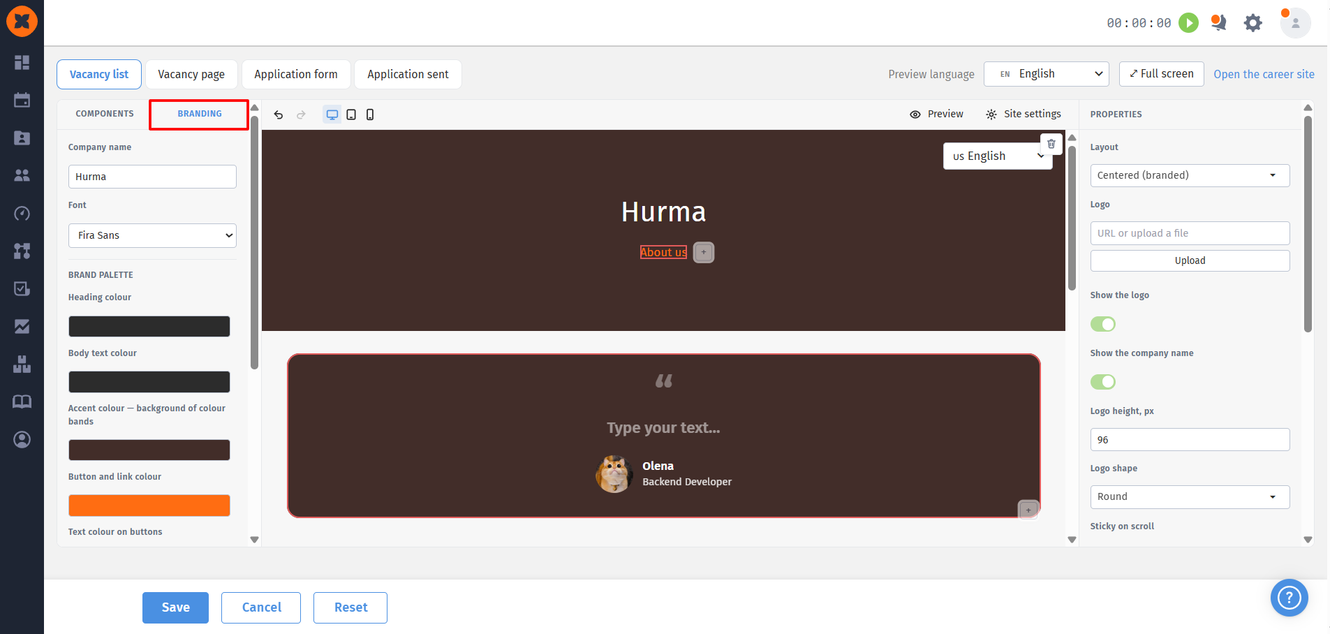
Company name: enter the official company name and upload your logo;
Font: select a corporate font for displaying text. Eight standard system fonts are available;
Brand color palette:
Heading color: specify the base color for all site headings. Individual headings can still be customized in the builder if needed;
Main text color;
Accent color: the color used for accent bars;
Buttons and Links: set the color for buttons and links;
Button text color: ensures sufficient contrast and readability of button labels.
Page background: choose a solid background color or upload your own background image for the entire site;
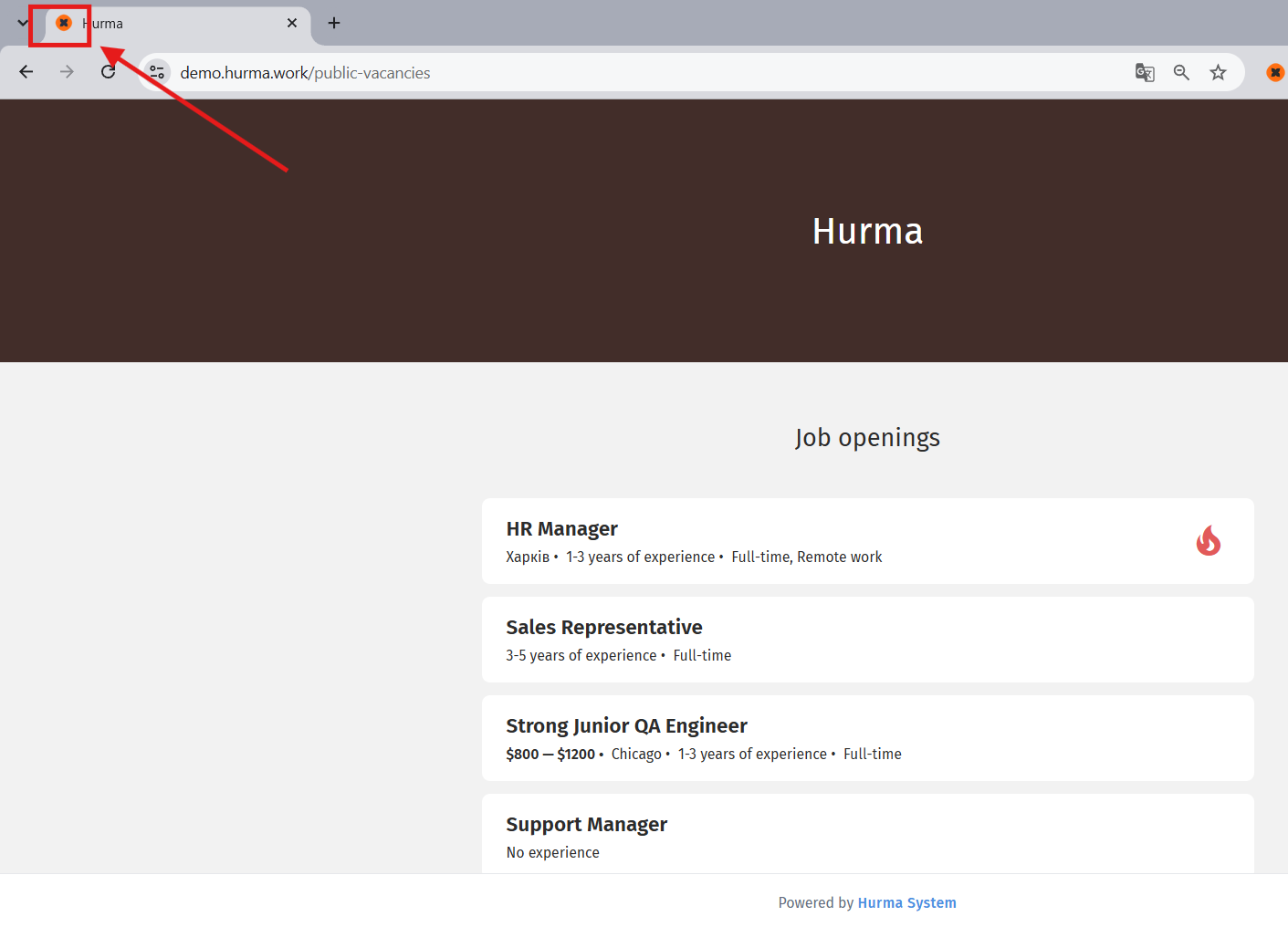
Favicon: a small icon (logo) displayed in the browser tab next to the name of your career site, as well as in candidates’ saved bookmarks.
“Back” button: allows you to quickly undo the last action;
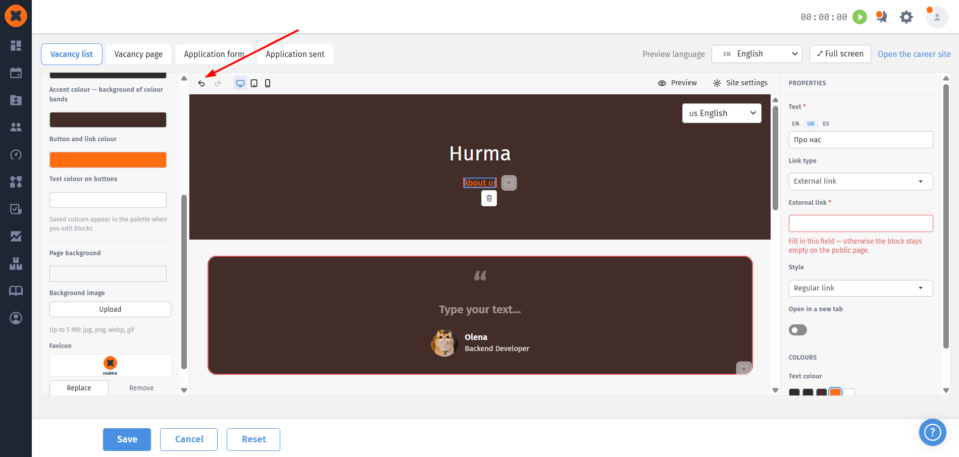
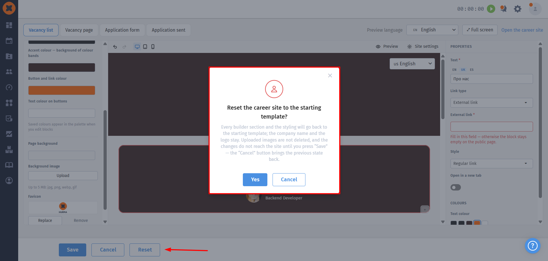
“Reset” button: if you are not satisfied with the customization results and want to restore the site to its initial state, click “Reset.” After confirming the action in the modal window and saving the changes, the site will be fully restored to its default appearance.